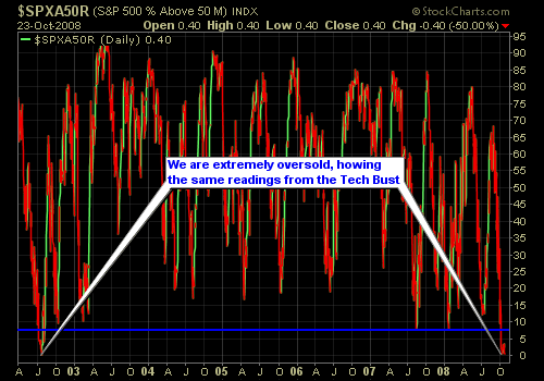
So far, this week has been pretty rough for the bulls. Not so much though for the bears and so far it has been a pretty good week for Shareplanner Subscribers. We have capitalized on some nice gains in SKF and QID. But the big question for many of you is just how oversold are
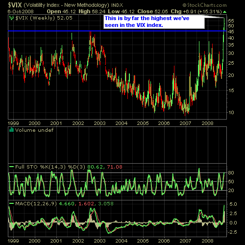
Here’s a couple of charts for you to take a look at. We are probably in the most oversold conditions that we have been in quite some time. Below is the VIX chart which measures implied volatility. It moves inversely to the market, so that it tends to spike when the market is declining.
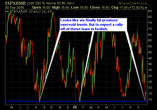
Quick look at where we are in the sell-off as of yesterday’s close. As you can see we are more oversold than we were in July and equal to the levels achieved in January of this year and August of last. This chart simpliy measures the S&P stocks that are trading below their 50-day moving
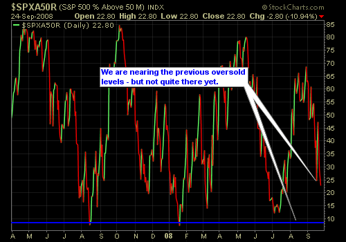
Amid political leaders working together trying to find a compromise on the financial crisis facing our markets, let’s take a look at where we are at in regards to reaching a potential oversold level that would likely see an upward bounce in the near-term. Here’s the chart…

An indicator that I use to monitor the overbought/oversold conditions of the market based on using the percentage of stocks trading above/below their 50-day moving average in the S&P. Unlike previous sell-offs that we have experienced in the past, this would lead one to believe that have a ways to go before getting near a
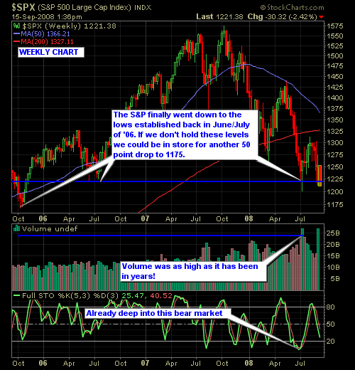
Weekly charts provide some of the best insight into what is going on in a particular stock or index. Funny thing is, most people ignore the weekly charts and instead rely only on the daily charts. However, the weekly charts tend to be much more clean and understandable from a market/stock direction stand point and

spc@shareplanner.com
(904) 800-8420
© Copyright 2025 | SharePlanner Inc. All Rights Reserved.
Disclaimer: The information provided on this website is for educational and informational purposes only. Ryan Mallory and/or SharePlanner are not licensed financial advisors, brokers, or tax professionals. The content on this site should not be considered as financial, investment, tax, or legal advice.
All information and opinions expressed herein are based on sources believed to be accurate and reliable. However, we make no representation or warranty as to their accuracy, completeness, or reliability. Any action you take upon the information on this website is strictly at your own risk.
Past performance is not indicative of future results. Investing involves risk, including the possible loss of principal. All investors should make their own decisions based on their specific investment objectives and financial circumstances.
This site may contain links to external websites that are not provided or maintained by or in any way affiliated with Ryan Mallory and/or SharePlanner. Please note that Ryan Mallory and/or SharePlanner do not guarantee the accuracy, relevance, timeliness, or completeness of any information on these external websites.
By using this website, you agree that Ryan Mallory and/or SharePlanner and any affiliated parties are not responsible for any losses or damages resulting from your use of or reliance on the information provided.
It is strongly recommended that you consult with a qualified professional before making any financial decisions.