
It is always concerning to me when the T2108 Chart starts diverging from the market
For those of you not familiar with the indicator, the T2108 chart measures the percentage of stocks that are trading above their 40-day moving average. Typically in a very healthy market where it is consistently making higher-highs and higher-lows, the T2108 indicator will be in the realm of 75% or more.
So with the S&P 500 hitting new all-time highs day after day (minus the last five trading sessions), one would expect that this indicator would be soaring right?
WRONG!

As of this post, only 43% of stocks are trading above their 40-day moving average. That means stocks are not doing nearly as well as the broader market and a small selection of stocks, big names at that, i.e. Apple (AAPL) and Facebook (FB) are the carrying the water for the rest of this market while everyone one else either treads water or sinks.
So check out the T2108 Chart that I have posted below.
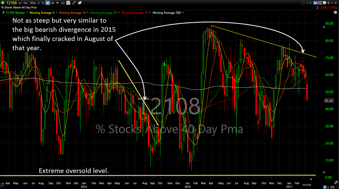
Startling when you consider it against the price action of the S&P 500, the Dow Jones Industrial Average, Nasdaq and Russell right?
With the T2108, you would think we are in the midst of a decent correction in equities
Back in August of last year, we saw a 100+ point correction over a three month period where T2108 went from 80% all the way to 20% before the election saved it. There could be an argument for that here, where we won’t necessarily sell-off hard, but more or less flat line or go just steadily drift lower for the next couple of months.
OR
Go back to late 2014 where price action drifted sideways while the T2108 diverged, until August 2015, when a decent size correction occurred and again in January of 2016 too.
So essentially, don’t sleep on this market, the selling opportunities could arise very soon, and you’ll want to make sure you aren’t asleep at the wheel or worse, find you are lazy in your risk management and not making sure you are preparing for a correction.


Welcome to Swing Trading the Stock Market Podcast!
I want you to become a better trader, and you know what? You absolutely can!
Commit these three rules to memory and to your trading:
#1: Manage the RISK ALWAYS!
#2: Keep the Losses Small
#3: Do #1 & #2 and the profits will take care of themselves.
That’s right, successful swing-trading is about managing the risk, and with Swing Trading the Stock Market podcast, I encourage you to email me (ryan@shareplanner.com) your questions, and there’s a good chance I’ll make a future podcast out of your stock market related question.
Watching the dollars rise and fall in your trading account can turn a well-planned swing trade into an emotional, deeply personal decision. In this episode, I explain why focusing on price action, percentage returns, and R-multiples can help you avoid cutting winners early, holding losers too long, and abandoning your trading plan.
Be sure to check out my Swing-Trading offering through SharePlanner that goes hand-in-hand with my podcast, offering all of the research, charts and technical analysis on the stock market and individual stocks, not to mention my personal watch-lists, reviews and regular updates on the most popular stocks, including the all-important big tech stocks. Check it out now at: https://www.shareplanner.com/premium-plans
📈 START SWING-TRADING WITH ME! 📈
Click here to subscribe: https://shareplanner.com/tradingblock
— — — — — — — — —
💻 STOCK MARKET TRAINING COURSES 💻
Click here for all of my training courses: https://www.shareplanner.com/trading-academy
– The A-Z of the Self-Made Trader –https://www.shareplanner.com/the-a-z-of-the-self-made-trader
– The Winning Watch-List — https://www.shareplanner.com/winning-watchlist
– Patterns to Profits — https://www.shareplanner.com/patterns-to-profits
– Get 1-on-1 Coaching — https://www.shareplanner.com/coaching
— — — — — — — — —
❤️ SUBSCRIBE TO MY YOUTUBE CHANNEL 📺
Click here to subscribe: https://www.youtube.com/shareplanner?sub_confirmation=1
🎧 LISTEN TO MY PODCAST 🎵
Click here to listen to my podcast: https://open.spotify.com/show/5Nn7MhTB9HJSyQ0C6bMKXI
— — — — — — — — —
💰 FREE RESOURCES 💰
— — — — — — — — —
🛠 TOOLS OF THE TRADE 🛠
Software I use (TC2000): https://bit.ly/2HBdnBm
— — — — — — — — —
📱 FOLLOW SHAREPLANNER ON SOCIAL MEDIA 📱
*Disclaimer: Ryan Mallory is not a financial adviser and this podcast is for entertainment purposes only. Consult your financial adviser before making any decisions.
You Might Like

South Korea: The Hidden Driver of US Tech Volatility

Stop Trying to Hit Home Runs: Start Trading Within Your Means
How to Trade Breakouts Without Getting Trapped