
There are drastic differences in each of the sectors
That is usually not the case. They tend to represent some off-shoot of the S&P 500, or in the case of Technology, as resemblance of the Nasdaq chart.
But now, each chart has a different look. obviously the majority of them are trending downwards, but still the technical difference in each is notable.
Here’s what I see as the top 3 sectors right now:
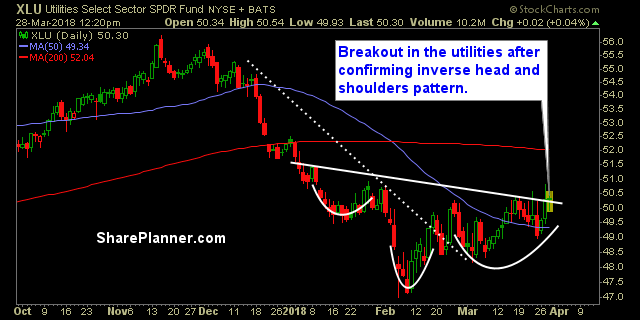
- Utilities
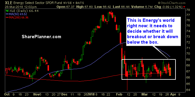
- Energy
- Discretionary
Obviously you don’t want Utilities at the top of your list, because that is a good sign that traders are looking for a place of safety for their capital.
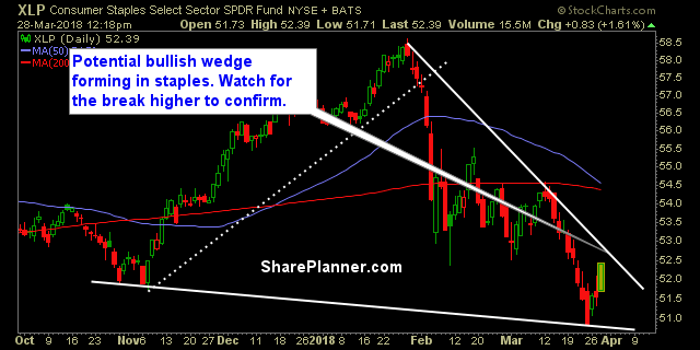
The 3 worse sectors are:
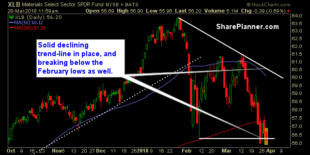
- Materials
- Staples
- All the other sectors not yet mentioned ?
The market is taking some licks right now and it is an incredibly difficult atmosphere out there. With April rolling around, and the first quarter coming to an end, perhaps the market will find a spring in its step
Let’s review the sectors:
Basic Materials (XLB)
Energy (XLE)
Financials (XLF)

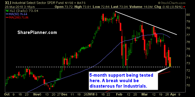
Industrials (XLI)
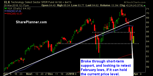
Technology (XLK)
Consumer Staples (XLP)
Utilities (XLU)
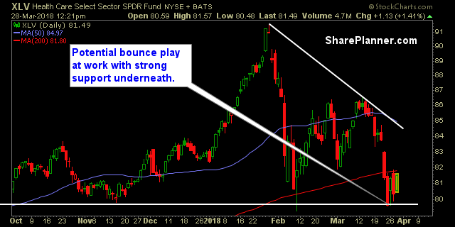
Health Care (XLV)
Consumer Disretionary (XLY)


Welcome to Swing Trading the Stock Market Podcast!
I want you to become a better trader, and you know what? You absolutely can!
Commit these three rules to memory and to your trading:
#1: Manage the RISK ALWAYS!
#2: Keep the Losses Small
#3: Do #1 & #2 and the profits will take care of themselves.
That’s right, successful swing-trading is about managing the risk, and with Swing Trading the Stock Market podcast, I encourage you to email me (ryan@shareplanner.com) your questions, and there’s a good chance I’ll make a future podcast out of your stock market related question.
Trading what you see and not what you think is one of Ryan's popular trading expressions that he has lived by in his 30 years of trading experience. In this podcast episode Ryan explains why it is so important to not think your way through the market but to be a trader who sees what to trade and reacts accordingly. If you are struggling as a trader, it may very well be that you aren't seeing but thinking your way through your swing trades.
Be sure to check out my Swing-Trading offering through SharePlanner that goes hand-in-hand with my podcast, offering all of the research, charts and technical analysis on the stock market and individual stocks, not to mention my personal watch-lists, reviews and regular updates on the most popular stocks, including the all-important big tech stocks. Check it out now at: https://www.shareplanner.com/premium-plans
📈 START SWING-TRADING WITH ME! 📈
Click here to subscribe: https://shareplanner.com/tradingblock
— — — — — — — — —
💻 STOCK MARKET TRAINING COURSES 💻
Click here for all of my training courses: https://www.shareplanner.com/trading-academy
– The A-Z of the Self-Made Trader –https://www.shareplanner.com/the-a-z-of-the-self-made-trader
– The Winning Watch-List — https://www.shareplanner.com/winning-watchlist
– Patterns to Profits — https://www.shareplanner.com/patterns-to-profits
– Get 1-on-1 Coaching — https://www.shareplanner.com/coaching
— — — — — — — — —
❤️ SUBSCRIBE TO MY YOUTUBE CHANNEL 📺
Click here to subscribe: https://www.youtube.com/shareplanner?sub_confirmation=1
🎧 LISTEN TO MY PODCAST 🎵
Click here to listen to my podcast: https://open.spotify.com/show/5Nn7MhTB9HJSyQ0C6bMKXI
— — — — — — — — —
💰 FREE RESOURCES 💰
— — — — — — — — —
🛠 TOOLS OF THE TRADE 🛠
Software I use (TC2000): https://bit.ly/2HBdnBm
— — — — — — — — —
📱 FOLLOW SHAREPLANNER ON SOCIAL MEDIA 📱
*Disclaimer: Ryan Mallory is not a financial adviser and this podcast is for entertainment purposes only. Consult your financial adviser before making any decisions.
You Might Like
How to Trade Breakouts Without Getting Trapped

Managing Headline Risk: How to Survive the News Cycle Without Losing Your Mind

What to Do After a Winning Trade