
The Chart of the Day… Chart comes courtesy of RogueTraderette.com and it offers a perfect comparison of what QE does to a country that employs it (USA) versus one that does not (Australian Market). Now you see how artificially inflated our market currently is. Quick Glance at the Market Heat Map and Industries Notables: What goes

The last time the markets became this difficult to time using the SharePlanner Reversal Indicator came on the heels of the Fed’s Quantitative Easing 2 (QE2). Now again we are getting various reversal signals before and after the QE3 announcement , and what you have is a perfect example of why federal centralized planning is a

The Chart of the Day… Quick Glance at the Market Heat Map and Industries Notables: While the market was up overall on the day, there was some real gomers in the S&P – particularly in Health-care. Telecom showed some weakness as well with VZ and T. Throw Consumer Goods and Utilities in as two

The Chart of the Day… Quick Glance at the Market Heat Map and Industries Notables: Consumer goods had some pretty noticable rough spots in PM, RAI, PEP, DF, LO, and MO Utilities lagged all together. Tech was lifted by the Apple iPhone 5 unveiling.

I have to say, that the latest rendition of the SPRI has me thinking strongly of adding a few hedge/short positions to counter-balance my portfolio some. I’m sitting on some nice gains on all my positions and the ones like Amazon.com (AMZN) that is way outside its Bollinger Bands are also opportunities that I’m
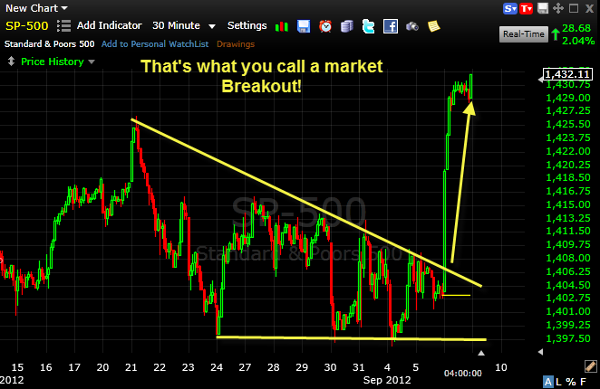
The Chart of the Day… Quick Glance at the Market Heat Map and Industries Notables: WAG, AIG PPL LO & RAI: If you can’t finish higher on a day like today – you’ve got issues. Financials followed by Tech went completely bonkers today.
The Chart of the Day… A picture is worth a 1,000 words… Chart found on a pretty cool site called SocialTrade.com Quick Glance at the Market Heat Map and Industries Notables: More green popping up on the grid then what we’ve seen lately. Healthcare showed respectable strength. Utilities, Financials, and Basic Materials held the market

Due to being on vacation over the Labor Day holiday, I wasn’t able to post an updated SPRI. However, when reading it today, you can see where we are possibly reversing now to the downside, but you also have to remember that because I am posting this on a Tuesday, it is only showing you

The Chart of the Day… From one of the SharePlanner’s regular contributors – and for the elliot wave theorists too. Quick Glance at the Market Heat Map and Industries Notables: I’d say that the S&P for the most part had a shadow of bearishness cast over it today. Basic Materials recovered nicely… and consumer

The Chart of the Day… I’ve been following Copper lately as a gauge on the market’s health – this chart shows a decisively bearish divergence. From SocialTrade.com Quick Glance at the Market Heat Map and Industries Notables: The source of today’s afternoon sell-off? Try Basic Materials, Technology and Industrials They should consider making

spc@shareplanner.com
(904) 800-8420
© Copyright 2025 | SharePlanner Inc. All Rights Reserved.
Disclaimer: The information provided on this website is for educational and informational purposes only. Ryan Mallory and/or SharePlanner are not licensed financial advisors, brokers, or tax professionals. The content on this site should not be considered as financial, investment, tax, or legal advice.
All information and opinions expressed herein are based on sources believed to be accurate and reliable. However, we make no representation or warranty as to their accuracy, completeness, or reliability. Any action you take upon the information on this website is strictly at your own risk.
Past performance is not indicative of future results. Investing involves risk, including the possible loss of principal. All investors should make their own decisions based on their specific investment objectives and financial circumstances.
This site may contain links to external websites that are not provided or maintained by or in any way affiliated with Ryan Mallory and/or SharePlanner. Please note that Ryan Mallory and/or SharePlanner do not guarantee the accuracy, relevance, timeliness, or completeness of any information on these external websites.
By using this website, you agree that Ryan Mallory and/or SharePlanner and any affiliated parties are not responsible for any losses or damages resulting from your use of or reliance on the information provided.
It is strongly recommended that you consult with a qualified professional before making any financial decisions.