
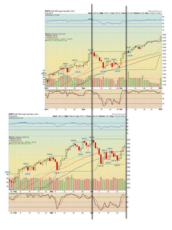
I was looking at April’s action in the indices, trying to figure out which way it’s gonna go out of this range boundary that we’ve been in since March. When looking at a (much) longer time frame, I noticed a similar-shaped pattern formed in the S&P back in 2010. I’ve tried to line them up below:
I need one of the SharePlanner pros to message me on how to upload zoomable images.
The top chart is of the Nov-Dec 2010 prices, the lower chart is today, markets closed on April 27, 2012. There are some striking similarities in this price movement, as any fool can plainly see. Even the indicators are behaving in a bit of a rhyming manner. What I find more interesting is how 2010 played out. Two days after the black line on the right, there’s a black, spinning top candlestick with HIGH volume, that I would interpret as a reversal indicator. If that interpretation is incorrect, I would appreciate your enlightenment!
The following day did drop, but the candlestick turned into a longtail and price double-reversed back up. Ever do that when playing Uno? Anyway, The 45-degree angle incline both before and after this movement is what I believe was some form or other of Quantitative Easing. And that certainly hasn’t stopped today, but I’ll spare you the central bank rant this time.
In full disclosure, I’m still bearish in my opinion. But these charts are telling me there’s a historical precedence for an upside outcome. On the other hand, these charts are NOT identical setups: the 50-day MA became a mean during the dip, instead of support, price movement leading up to the dip is different (may mean nothing unless your into Wave theory), and volume is lower by about an average of 1 billion shares. But if a central bank is out there hitting CTRL+P on the money presses, then technical setups and lines of resistance just don’t seem to matter.
But there is also the curious case of the Russell 2000. I made the same comparison of the same dates in history, using IWM so that I could see volume. Behold:
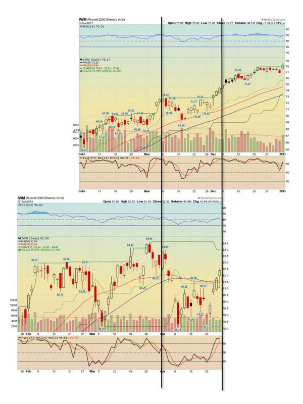 First of all, volume is roughly the same on this ETF, although it varied much more day-to-day in 2010. The price setups are also “roughly” similar, where the price-action prior to the black lines is flat against resistance, followed by a jump then the big dip. But what strikes me is how price fell way below the MA’s, even the short-term MA dropped below the longer one, and RSI is on a lower level overall.
Another point is that the 2010 price at the black line was the highest price so far on the chart, beating the prior high before the dip, at the first black line. This is why I like to compare the Russell (through IWM) to the S&P 500, the relative price action makes a good leading indicator. IWM’s price had recovered MORE than the S&P between the two black lines. But neither IWM nor the S&P have reached the previous high yet, which they’ll need to do early next week if I would expect any continued melt-up to reach new highs.
Another reason I’m not so positive is the weekly chart for IWM.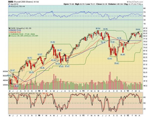 While the short-term MA is pulling up, the long-term is flat to down; RSI and stochastics are showing signs of bearish divergence, and the 1Q meltup just has the feel up an airplane pulling up too fast, and is now fighting a power-on stall. I keep hearing the talking heads saying that economic indicators are wonderful and happy, and I even sensed some early pinges of euphoria back in the “Best Time in a Generation to Buy Stocks” heydays of March. Companies are lowballing earnings reports, and there are rumors that they’re sandbagging Q2 results ahead of the curve, because they know it’s gonna be lower. Did anyone notice Apple guided down for Q3 (took me a while, but I think these are fiscal quarters)?
I’m looking for one more big dip, maybe to December levels, before the final rise to new highs. Sometime during the late Spring would be perfect to get the jitters out of the way, just in time to recover to yearly highs by election-time in November. I’m just sayin’.


Welcome to Swing Trading the Stock Market Podcast!
I want you to become a better trader, and you know what? You absolutely can!
Commit these three rules to memory and to your trading:
#1: Manage the RISK ALWAYS!
#2: Keep the Losses Small
#3: Do #1 & #2 and the profits will take care of themselves.
That’s right, successful swing-trading is about managing the risk, and with Swing Trading the Stock Market podcast, I encourage you to email me (ryan@shareplanner.com) your questions, and there’s a good chance I’ll make a future podcast out of your stock market related question.
Watching the dollars rise and fall in your trading account can turn a well-planned swing trade into an emotional, deeply personal decision. In this episode, I explain why focusing on price action, percentage returns, and R-multiples can help you avoid cutting winners early, holding losers too long, and abandoning your trading plan.
Be sure to check out my Swing-Trading offering through SharePlanner that goes hand-in-hand with my podcast, offering all of the research, charts and technical analysis on the stock market and individual stocks, not to mention my personal watch-lists, reviews and regular updates on the most popular stocks, including the all-important big tech stocks. Check it out now at: https://www.shareplanner.com/premium-plans
📈 START SWING-TRADING WITH ME! 📈
Click here to subscribe: https://shareplanner.com/tradingblock
— — — — — — — — —
💻 STOCK MARKET TRAINING COURSES 💻
Click here for all of my training courses: https://www.shareplanner.com/trading-academy
– The A-Z of the Self-Made Trader –https://www.shareplanner.com/the-a-z-of-the-self-made-trader
– The Winning Watch-List — https://www.shareplanner.com/winning-watchlist
– Patterns to Profits — https://www.shareplanner.com/patterns-to-profits
– Get 1-on-1 Coaching — https://www.shareplanner.com/coaching
— — — — — — — — —
❤️ SUBSCRIBE TO MY YOUTUBE CHANNEL 📺
Click here to subscribe: https://www.youtube.com/shareplanner?sub_confirmation=1
🎧 LISTEN TO MY PODCAST 🎵
Click here to listen to my podcast: https://open.spotify.com/show/5Nn7MhTB9HJSyQ0C6bMKXI
— — — — — — — — —
💰 FREE RESOURCES 💰
— — — — — — — — —
🛠 TOOLS OF THE TRADE 🛠
Software I use (TC2000): https://bit.ly/2HBdnBm
— — — — — — — — —
📱 FOLLOW SHAREPLANNER ON SOCIAL MEDIA 📱
*Disclaimer: Ryan Mallory is not a financial adviser and this podcast is for entertainment purposes only. Consult your financial adviser before making any decisions.
You Might Like

South Korea: The Hidden Driver of US Tech Volatility

Stop Trying to Hit Home Runs: Start Trading Within Your Means
How to Trade Breakouts Without Getting Trapped