
Look at the side-by-side chart below and see if you see any similarities.
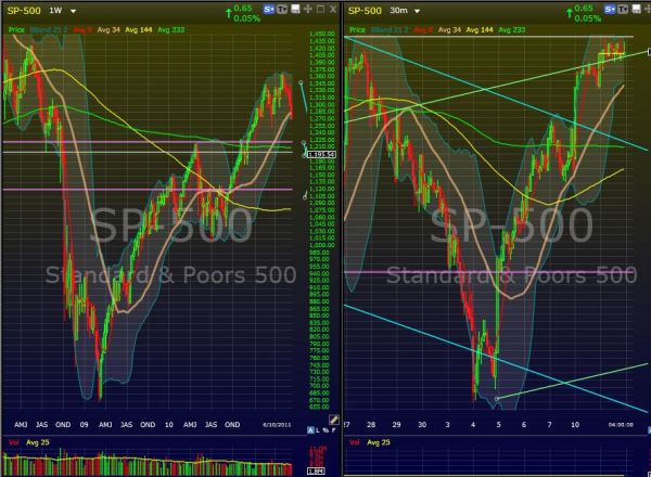
Is this what a V-shaped Recovery looks like? While looking at 30-min and hourly charts of IWM and the S&P, I thought I noticed a familiar pattern. The left chart is the weekly S&P of late 2008 through 2010, right before the stall and crash that we’re in now. The right chart is the current, hourly chart up until yesterday’s close.
The shape is not exact, but there are similar pause points and behavior that seem to rhyme. Even the moving averages show similar shapes. Now, there are certainly other factors that preceded the left chart, and the index had a very different history leading up to the weekly V. But I wouldn’t discount the similarities completely. This might be the early stages of Elliot Wave Theory in development, but I’ve already stated that I don’t follow that explicitly.
Here’s the same two charts again, with the left side extended to present day:

The trendlines are cluttering up the current pothole we’re in, but you can still tell where the price is. For sake of more clutter, I removed the Fibonacci lines that correspond roughly with the two, pink, horizontal lines in the left chart (you can see the lower in the right chart, too), which have defined the range we’ve been in. The upper is 61.8%, the lower is 50%.
My point is that I would expect to see a dip within a few days to similar levels. The trick is where to put the Fibo upper and lower boundaries. My best guess puts the retrace range at 1,151-1,170, which is where we paused in the right chart on the way to the top.
We’re due for a correction, and if the levels I mentioned above hold, we might start to see higher highs and lows. Even a crash to 1,120 would setup a nice H&S pattern for the beginning of a recovery. My bias is grown more bullish as we stay flat, but we’re still in a downtrend until proven otherwise!
I need to work on not jumping the gun and entering positions 2-3 days too early for 1/2 sized gains compared to the holes I sit in first. I’m not shorting this tape until it REALLY starts heading down. Stop-sweeps and head fakes have abounded recently, and tight stops have become expensive!
Here’s the recent crash on the hourly:

Another interesting phenomenon is the three “W”s, almost looks like some kind of logo. I’ve heard of V-shaped recoveries and W-shaped recoveries. It would appear that U.S. markets have attempted W recoveries for 2 months, now. It seems there’s a real effort to keep prices up, and I still believe that we’ll be looking forward to S&P of 1600 after another 16-18 months. That is my bias over the long term, but the daytrader is still king in this volatility!
So ride the trend and don’t fight the tape! Good luck out there.


Welcome to Swing Trading the Stock Market Podcast!
I want you to become a better trader, and you know what? You absolutely can!
Commit these three rules to memory and to your trading:
#1: Manage the RISK ALWAYS!
#2: Keep the Losses Small
#3: Do #1 & #2 and the profits will take care of themselves.
That’s right, successful swing-trading is about managing the risk, and with Swing Trading the Stock Market podcast, I encourage you to email me (ryan@shareplanner.com) your questions, and there’s a good chance I’ll make a future podcast out of your stock market related question.
Watching the dollars rise and fall in your trading account can turn a well-planned swing trade into an emotional, deeply personal decision. In this episode, I explain why focusing on price action, percentage returns, and R-multiples can help you avoid cutting winners early, holding losers too long, and abandoning your trading plan.
Be sure to check out my Swing-Trading offering through SharePlanner that goes hand-in-hand with my podcast, offering all of the research, charts and technical analysis on the stock market and individual stocks, not to mention my personal watch-lists, reviews and regular updates on the most popular stocks, including the all-important big tech stocks. Check it out now at: https://www.shareplanner.com/premium-plans
📈 START SWING-TRADING WITH ME! 📈
Click here to subscribe: https://shareplanner.com/tradingblock
— — — — — — — — —
💻 STOCK MARKET TRAINING COURSES 💻
Click here for all of my training courses: https://www.shareplanner.com/trading-academy
– The A-Z of the Self-Made Trader –https://www.shareplanner.com/the-a-z-of-the-self-made-trader
– The Winning Watch-List — https://www.shareplanner.com/winning-watchlist
– Patterns to Profits — https://www.shareplanner.com/patterns-to-profits
– Get 1-on-1 Coaching — https://www.shareplanner.com/coaching
— — — — — — — — —
❤️ SUBSCRIBE TO MY YOUTUBE CHANNEL 📺
Click here to subscribe: https://www.youtube.com/shareplanner?sub_confirmation=1
🎧 LISTEN TO MY PODCAST 🎵
Click here to listen to my podcast: https://open.spotify.com/show/5Nn7MhTB9HJSyQ0C6bMKXI
— — — — — — — — —
💰 FREE RESOURCES 💰
— — — — — — — — —
🛠 TOOLS OF THE TRADE 🛠
Software I use (TC2000): https://bit.ly/2HBdnBm
— — — — — — — — —
📱 FOLLOW SHAREPLANNER ON SOCIAL MEDIA 📱
*Disclaimer: Ryan Mallory is not a financial adviser and this podcast is for entertainment purposes only. Consult your financial adviser before making any decisions.
You Might Like

South Korea: The Hidden Driver of US Tech Volatility

Stop Trying to Hit Home Runs: Start Trading Within Your Means
How to Trade Breakouts Without Getting Trapped